
UX Case Study: Enhancing the User Journey to LLBean’s Signature Collection
As part of my research, I created a Facebook group of LLBean fans and classic fashion enthusiasts to observe how real users navigate the brand’s website. I asked ten participants to visit llbean.com on a desktop or laptop computer and try to find the LLBean Signature collection, prompting them to share what they noticed first, where they clicked, and how confident they felt along the way. Their feedback on what was easy, difficult, or confusing about the site’s navigation provided valuable insights into how effectively the Signature line is surfaced within the overall shopping experience.
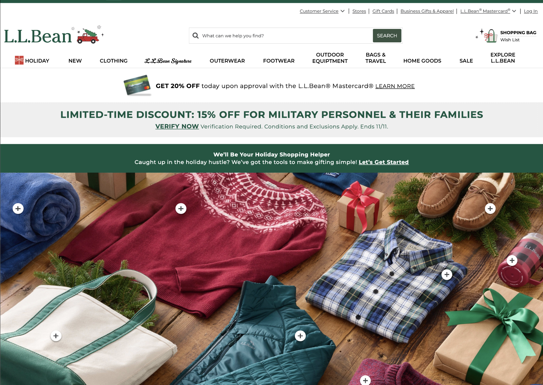
I learned that eight of the ten people I surveyed had trouble finding the Signature Collection on the L.L.Bean website. Most of them ended up typing "Signature" into the search bar to find it. One of the most interesting things I learned was that most of the people I surveyed did not know that L.L.Bean had a Signature collection, and those who did know had forgotten about it. Another interesting piece of information I learned was that once they finally found the Signature collection, they loved it and wanted to purchase the entire look the model was wearing. My thought was that if L.L.Bean made it easier to locate the Signature collection, they could also make more sales if the customer could shop the entire look the model was wearing. This concept could be used across the entire website, leading to more customer purchases.
Thank you for reading! Please feel free to watch my video for further explanation.