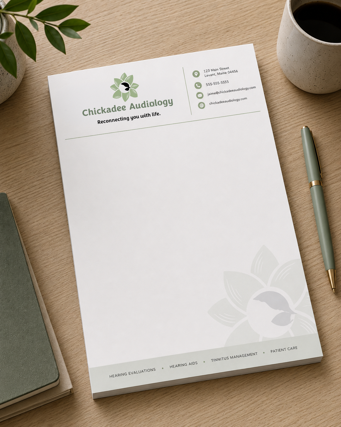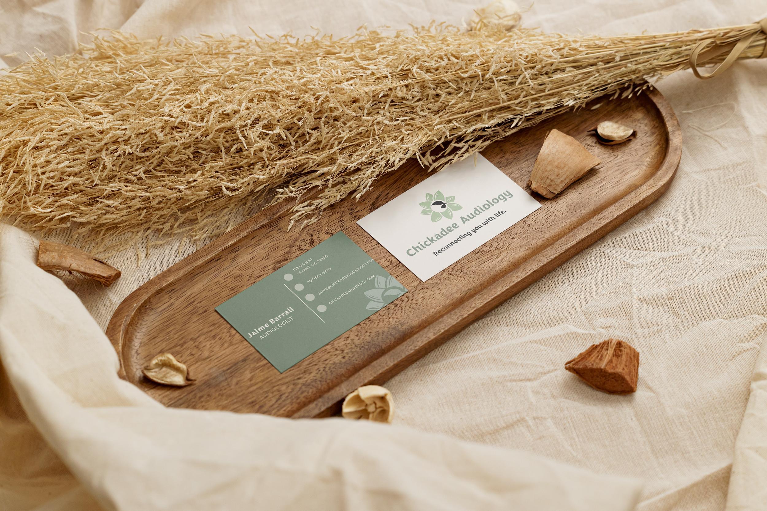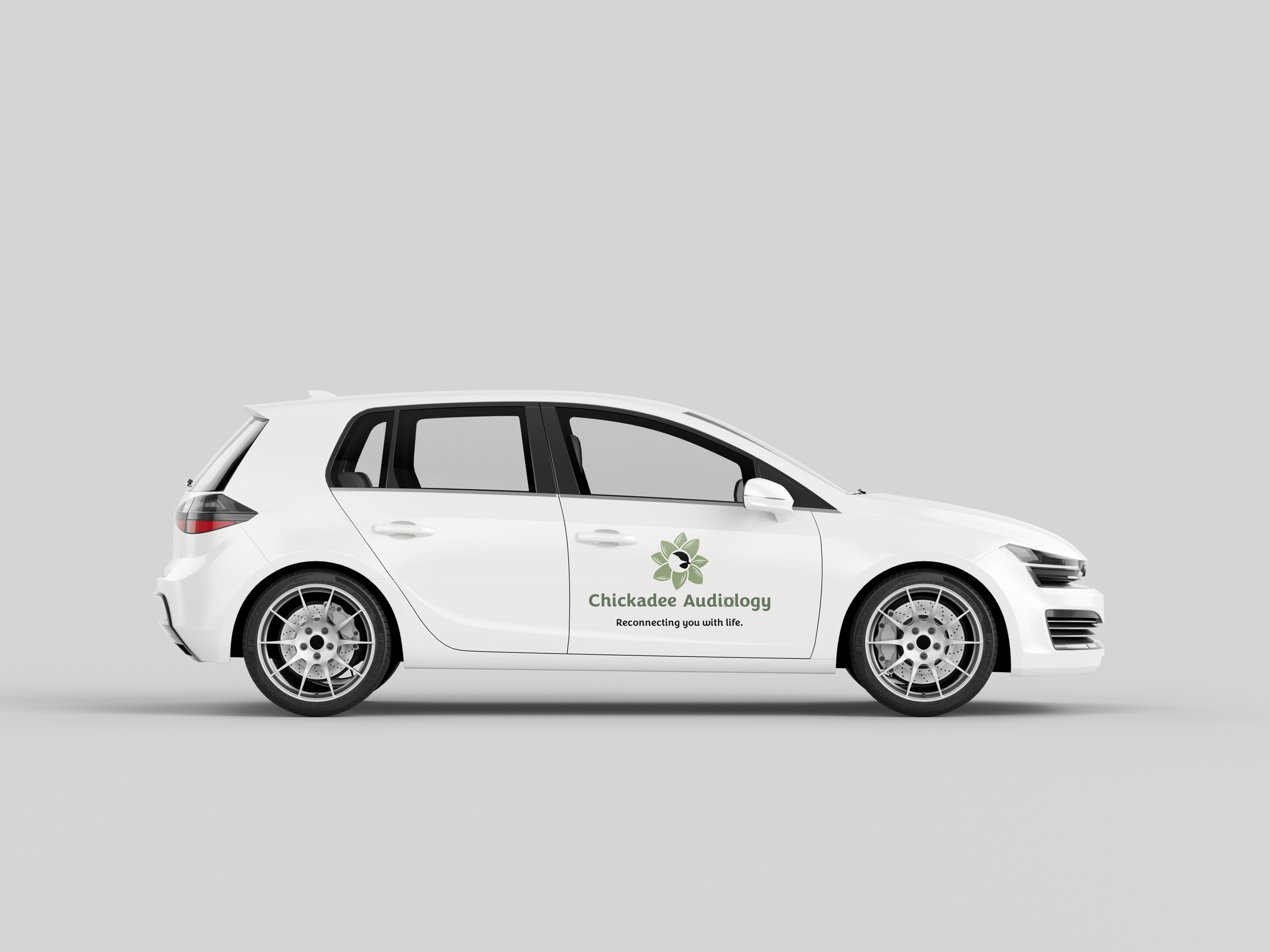
DESIGNING THE IDENTITY FOR A MOBILE AUDIOLOGY SERVICE
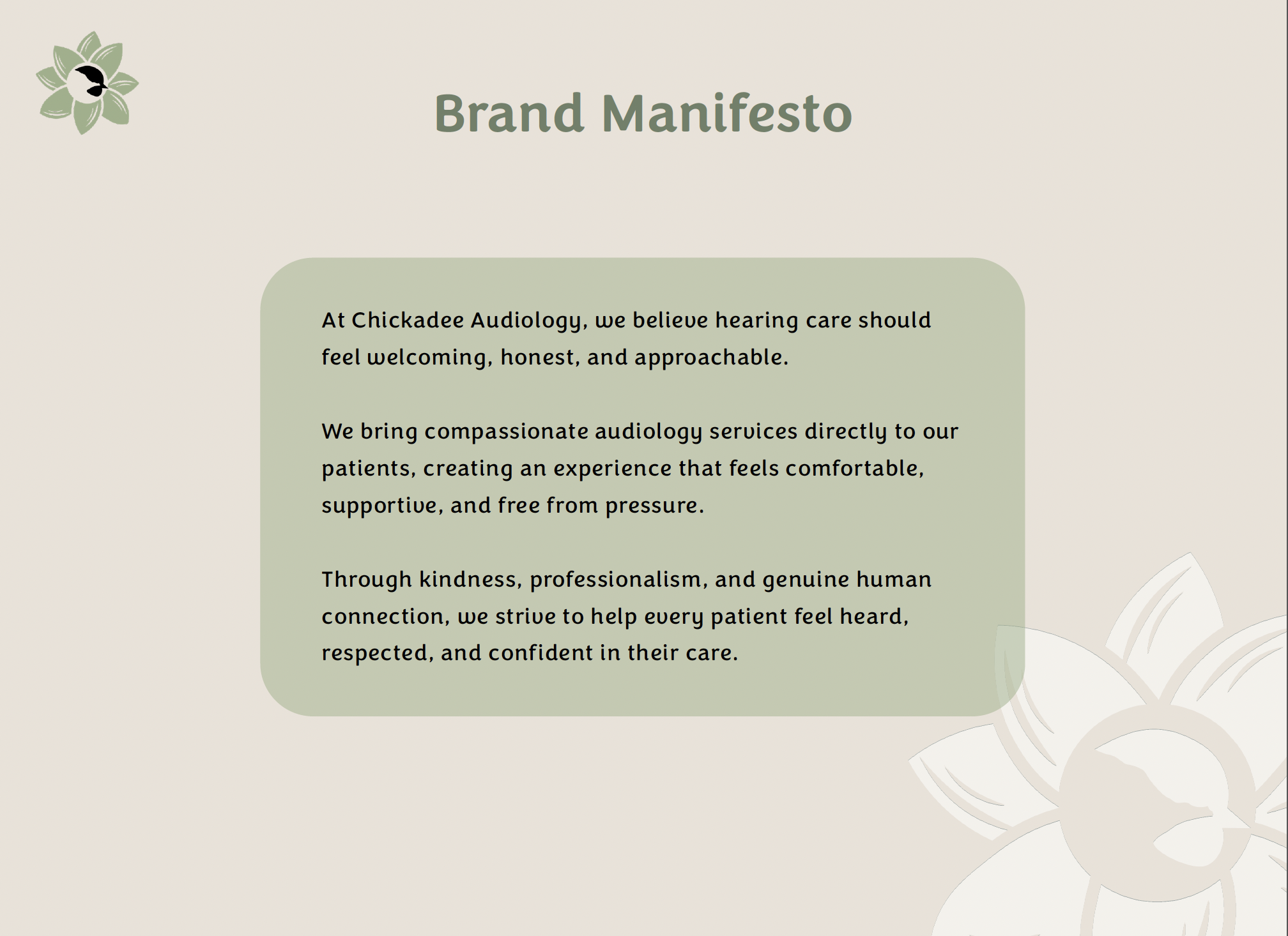
I had the privilege of working with Jaime, a Doctor of Audiology with a Certificate of Clinical Competence in Audiology, on developing the identity for her brand, Chickadee Audiology. In her career, Jaime has found that many people in her Maine community are unable to access hearing care, whether it be getting in for an appointment within a reasonable timeframe or struggling with transportation. Jaime found a flaw in the system and decided to attempt to fix it by starting her own mobile audiology business.
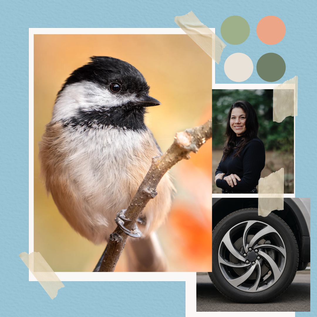
To set her business apart from other audiologists in Maine, I knew I had to develop a brand identity system that stood out from the rest of the audiology practices in the area. The most important question was why would someone choose Chickadee Audiology over another audiologist? Of course, Jaime’s business is different because she comes to you–that was obvious. We had to design a logo that represented mobility and Jaime’s lovely, personable, and caring personality. We also had to represent the Maine state bird, the Chickadee, without being too obvious. And we had to do all of this without featuring a human ear or a hearing aid in the logo design, as that would be very similar to many of her competitors and wouldn’t allow her to stand out among the rest.
I was lucky to gain Jaime’s trust early in the project. She had a vision and gave me some good insight about what she was looking for in a brand identity. I started researching audiologists in the Central Maine area and began building a brand strategy for her business. I shared my findings with her along the way, and she began to understand that the goal wasn’t just to create a logo. It was first to understand her positioning in her industry so that we could then learn what makes her different and convey it to her audience.


The goal with this logo was to create something that came across as friendly and comforting while conveying motion and mobility. I knew that Jaime preferred not to include a human ear or hearing aid in the logo mark, but I felt compelled to include some reference to an ear without being totally obvious.
RATIONALE:
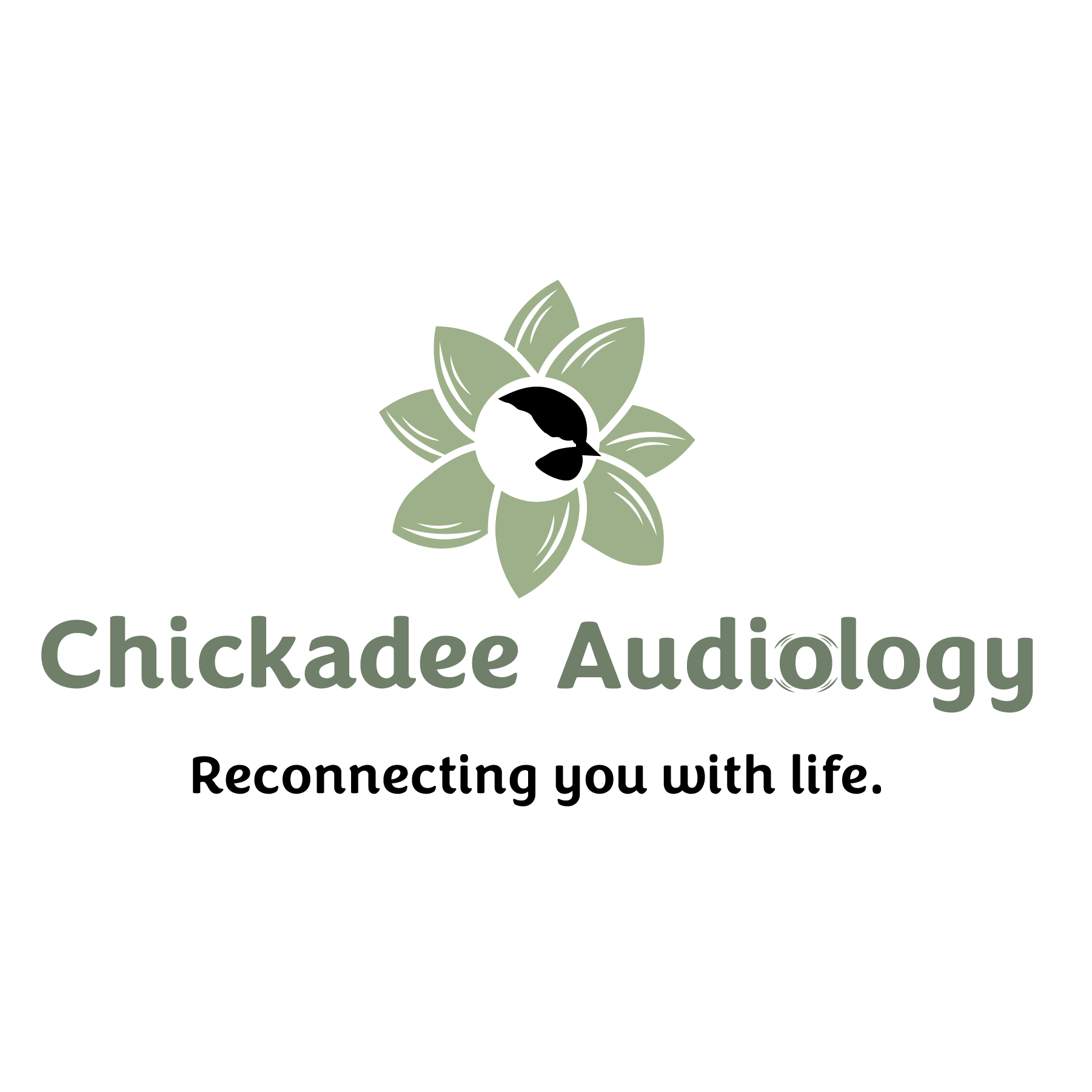
This logo concept was inspired by the lamb’s ear plant, known for its softness, comfort, and calming qualities. Instead of using the traditional human ear symbol often seen in audiology branding, the design takes a more organic and approachable direction through floral-inspired forms that feel nurturing and welcoming.
At the center, the chickadee represents communication, familiarity, and human connection, reflecting the emotional impact of hearing care and staying connected to everyday life. The circular composition also symbolizes movement and mobility, subtly referencing Chickadee Audiology’s mobile service model.
Overall, the logo is designed to feel compassionate, modern, and experience-focused while helping the brand stand apart from more clinical healthcare aesthetics.
THE PROCESS BEHIND THIS MEANINGFUL BRAND MARK
MOODBOARD